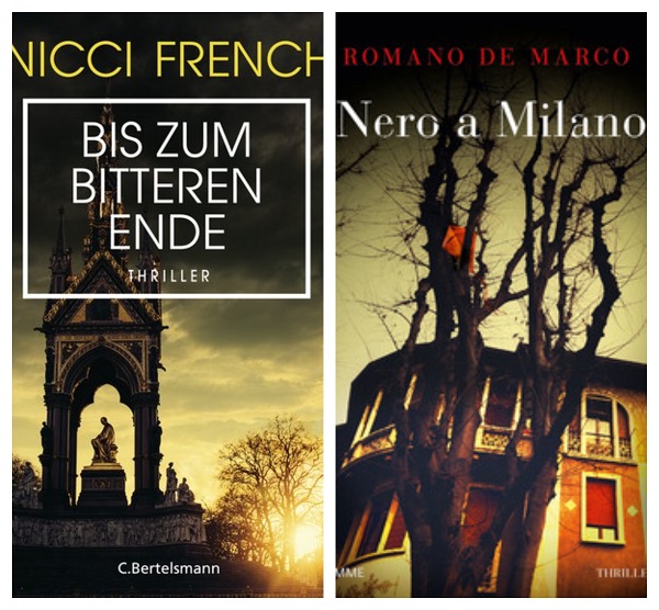
One of my proudest achievements as a professional photographer is seeing my work published on at least 6 physical book covers, licensed via Arcangel Images. In August, they notified me of two of my latest scores:

Here are the remaining four on a slideshow! The originals on left (cropped).
Getting started as a Fine Art Book Cover Photographer
About a year ago I wrote a blog post on my experiences over at Arcangel Images, a premium book-cover stock agency. I then vented on how I was frustrated after not having any licenses and after about two years a few came through, which finally gave me hope to continue uploading regularly. You can check out this post here.
“About a year ago, with nothing to show for all my hard work (despite some 400 images accepted at the time), I almost gave up on them. With no idea about views or zooms (like in Alamy), I had no idea how close or not I was to reaching my first sale. Just kept uploading despite growing frustrations.
Likewise with selling personal prints as Print on Demand, I was growing frustrated until finally getting some sales in May, but of course not as many as Master Steve who’s on a roll!
However, I’m glad I didn’t give up, which just goes to show that I probably have a high pain tolerance and perhaps I’m a little bit stubborn!”
A year later and 321 more images uploaded, although there have only been two additional licenses (above), I feel that my book cover skills have improved considerably. It should now only be a matter of short time before my port is regularly picked up by image editors.

How much would you get paid for each book cover
You’re probably wondering how much each of those licenses were flogged for. Well, really depends. Without getting into specifics on each of the book covers, they are on average in the low $100s each, which is considerably more than you would earn via a RF Microstock license, but keep in mind that the vast majority of images would be licensed as Rights-Managed exclusive.
7 Tips on how to make your images stand out as fine book covers
Tip 1: Embrace your dark side
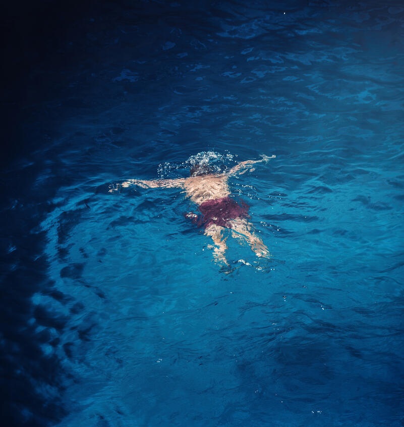
Book cover artwork is very different than my regular bread-and-butter microstock. Essentially it’s pure fine art in that the communication isn’t immediately clear and open to interpretation. Take the following image as an example:

It’s uncomfortable, dark and purposely crooked (adding to the discomfort). Plenty of negative space (more on this later) also adds to the wider scene and the fact that it’s completely dark on the far left leaves the imagination open to all sorts of spooky stuff…

The image above, on the other hand, is more clear about where the subject is and what is trying to communicate, but still generates negative uncomfortable emotions as the scene has a claustrophobic feel of perhaps a prison / torture cell. Therefore, the lesson here is that you have to dig deep within you to find your dark side and channel that energy into concepts that may make for useful concepts.
Perhaps you’ve just been through a difficult breakup with a loved one and feeling heartbroken. Many novels, as probably already know, are about such scenarios.

Creating Destruction
Or perhaps you’re in a disaster-type of mood. Using Photoshop actions, you can create disaster / dystopia themes that would make for dynamic book covers, such as the following!


Tip 2: Verticals work better than horizontal
Due to the nature of the real-world book publishing dimensions, most book cover images licensed are verticals. This goes against the grain of most digital mediums that encourage horizontal uploads (which can easily be cropped for vertical usage). Unsurprisingly, most of my the 6 licensed book covers were verticals.
However, purely vertical uploads are best when uploading for book covers since it maximises the potential copy space at both the bottom and top of the points of interest (more on this later). Here’s some examples of my favourite vertical images:


Tip 3: Include loads of copy space
It (almost) goes without saying that book covers will need plenty of text, such as obviously the title and author’s name. Therefore, you can’t go wrong by shooting extremely wide (ideally vertically) and including space around the main subject. I will illustrate this with the following three examples, circled in red where potential text would be placed by editors:


Tip 4: Include at least one interesting person
This is one that I should do more of, to be honest. Including at least one person within the frame to create a story should add to its commercial value since editors want images that readers can identify with in the respective story. What should the person be doing? Well, it really depends on what you wish to communicate!
Back of a girl in a red coat
The classic thriller-genre book cover cliche is one of a woman wearing a red coat with her back turned.

According to Rekha Garton in her article entitled, “The most cliché book cover photos and why they sell“:
“It took me all of two minutes to find these just by looking on Amazon Thriller books. I watched a thing with the author James Patterson before and he actually commented on the fact there a million books out there with a girl in a red coat now, lost in a haze of red. But, they are compelling. They work stylistically, they have almost become familiar to all of us, especially thriller readers, if you see the back of a girl wearing a red coat, it’s the sign it’s a thriller with a female character. It’s become a good go too; so I don’t see this trend dying anytime soon AT ALL.”
In fact, the colour red is powerful in all sorts of photography…you probably remember the use of selective-colouring in the Oscar Winning film, Schindler’s List.

Copyright: Universal Pictures
Select interesting people
Shooting for a book cover is completely different to a microstock and a fashion shoot since you have a much wider range of characters to choose from, as long as the character demonstrates personality and authenticity. From the few model-released images I have, these are my favourite, although none have yet been picked up (fingers crossed):


Using the same model above on same day, I focused on her distinctive luscious red lips, using an extremely narrow depth of field:

Tip 5: Use VSCOs
Although film photography is pretty much dead but for the hardcore enthusiasts, you can still replicate the feel and look of film by using VSCO presets.
These presets are available for use in Lightroom created exactly for Nikon, Sony cameras, Fuji and Canon bodies. In addition, they deal with RAW files, since this format gives you great flexibility to change the photo to suit your needs. The world is your oyster and it’s highly personal the type of look you’re going for…here are some of my favourites and some of the emotions I was trying to evoke:

Interesting, this scene from James Bond’s Casino Royale was filmed there:
Example 2

Word of warning: Some editors prefer to add their own effects in post-processing, so it may be wise to not go too heavy on the textures and filters.
Tip 6: Aim for unique photographic techniques & angles while shooting
This tip applies to pretty much all forms of creative photography. Aim to capture a subject in a unique way to stand out from the competition. This may mean using selective focus, motion blur and composition to better tell your story. Or it’s simply just looking up!
Combining these techniques with the above other tips should increase the images’ commercial value. Here are some examples:


Tip 7: Combine your book cover photography with your regular shoots
It’s rare that I will go out one day and think, “Oh, today I’ll shoot for a book cover!”…often it’s just a coincidence as I’m looking through batches at home and I see a regular stock image that I think I can transform into a book cover. This can be tricky since I’m often shooting horizontally!
For instance, I’m doing quite a few real estate / property shoots and two such simple images I thought would make for a book cover and lo and behold, they’ve been accepted into Arcangel collection:


Hope this is useful for your own line of bread-and-butter work.
More tips
For more tips, I would suggest to check out these resources:
What we look for in book cover photography by Arcangel
Arcangel Staff favourite book covers
Getting started
Interested in being an Arcangel Contributor?
Interested in being a Trevillion Contributor?
See latest post at www.Stockstudio.io
Best Places to Sell Stock Photos – Transitioning to Book Cover Photography
Would appreciate if you could help me out!
Above and throughout the blog, as you can appreciate, I’ve given quite a bit of my time to help you make sense of this complicated stock industry and focus on making money. I’ve also given away earnings info on some of my best-sellers which will directly lead to those images reducing their value (how much is impossible to say).
If you feel that the information above and at other posts is useful and if you’re so included, kindly donate as much as you feel is reasonable by clicking on the following link below:
Donate Now!
About Alex
I’m an eccentric guy on a quest to visit all corners of the world and capture stock images & footage. I’m determined not to waste my life away as a corporate drone and have devoted six years to making it as a travel photographer and freelance writer. I hope to inspire others before it’s too late.
I’m proud to have written a book about my adventures which includes tips on making it as a stock travel photographer – Brutally Honest Guide to Microstock Photography

Leave a reply to Pier Cancel reply