When shooting for book covers, thinking about creating effective space for potential text placement is one of the most important factors. This consideration may make a stark difference between one similar image being overlooked by a potential buyer and another being licensed.
In this illustrative post I’ll be thinking like a Designer and discussing some of my thought process for creating effective compositions. I’m by no means an expert in design and actually quite clueless about fonts, colours, etc, but I do know about photography!
Therefore, I’m happy to share with you some know-how I’ve picked up along the way in the form of five tips for creating strong compositions for effective text placement – let’s get started!
Designing for a book cover is pretty complicated!
As previously mentioned, although I’m a photographer / videographer, not a designer, I’ve increasingly begun putting myself in the shoes of Designers. This is a useful exercise because you’d be one step closer to matching the markets’ needs with your talent.
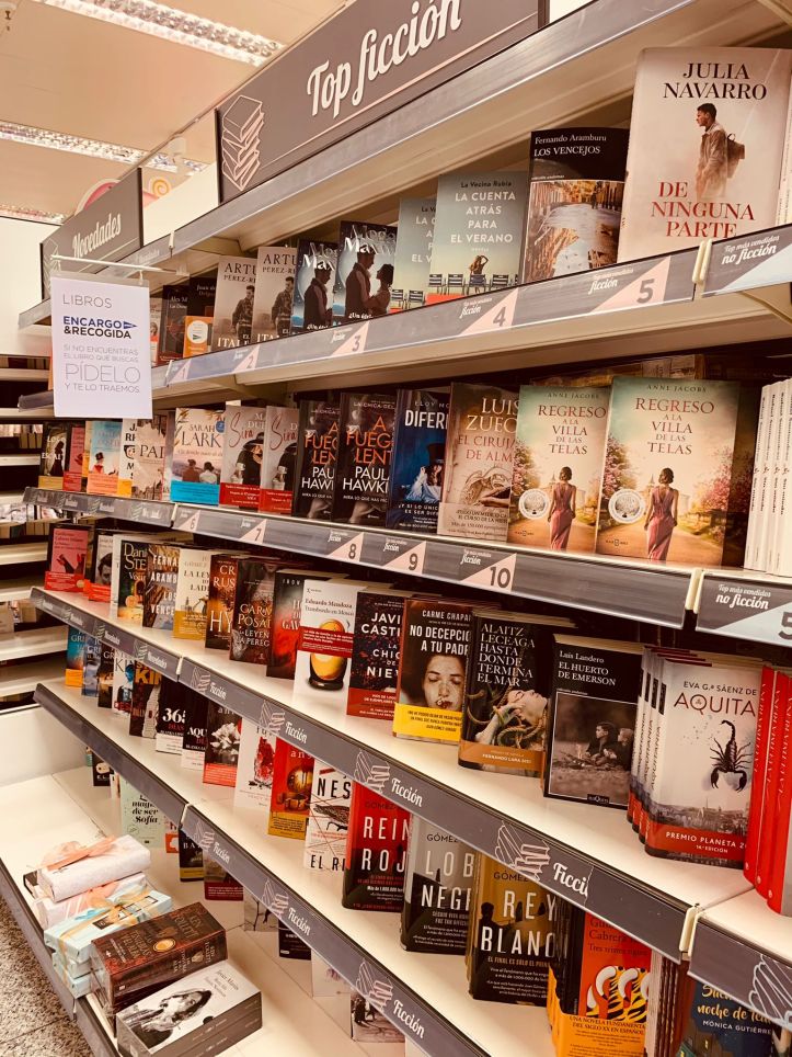
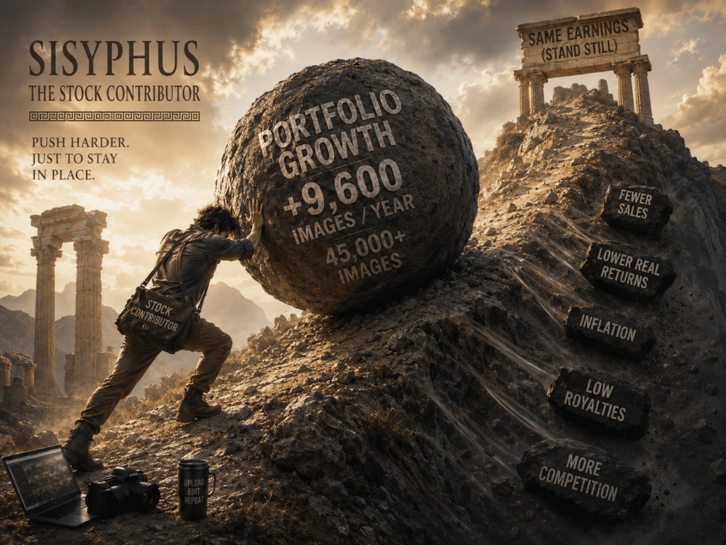
The first step, as I discussed in quite a bit of detail on my October 2021 earnings report, is to look at current book covers for examples as to what is out there. This can be at your local bookshop or online in Amazon or WHSmiths. Do your research!
Anatomy of a book cover
Physical book covers may look simple but there’s a lot going on in terms of its anatomy.
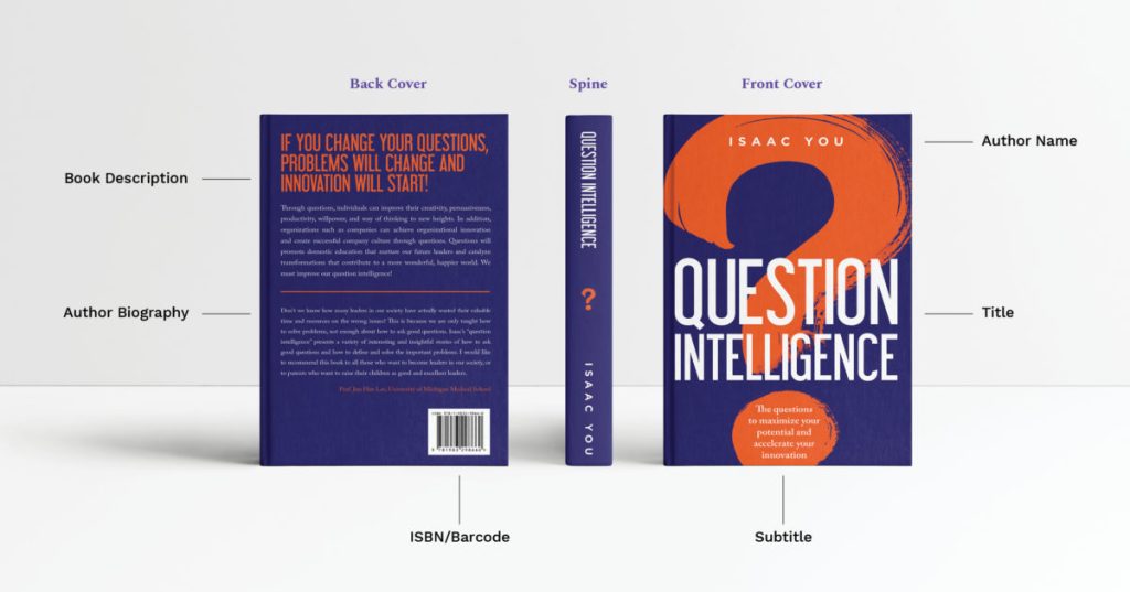
Obviously the front cover is what stands out, but you’d do well to start thinking about the spine and back covers. These considerations are most important when creating horizontal images for a wrap-around book cover (front-spine-back) – more on this later.
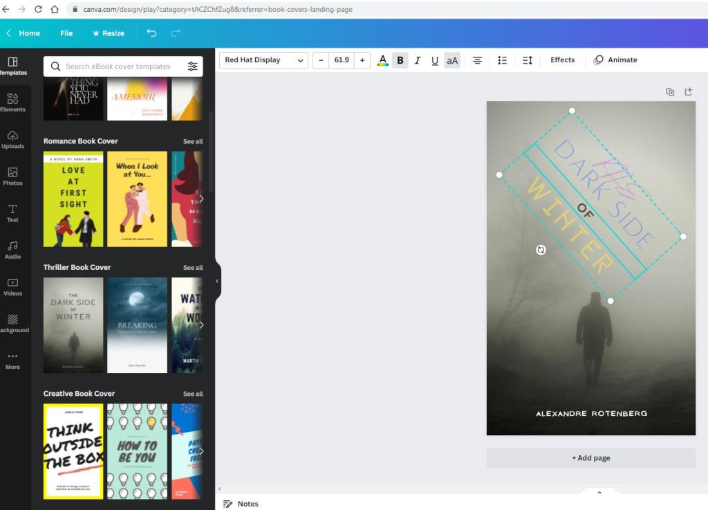
Testing your potential book covers on Canva Free Book Cover Maker
I highly recommend taking some of your potential book covers and testing out the spaces on Canva’s “The Free Book Cover Maker With Stunning Layouts“. Otherwise, play around with one of their existing images as a template to insert your text/font.
Five tips for effective text placements
Example 1 – Top and Bottom of subject
The most obvious text placements are at at the top and/or bottom of the subject.
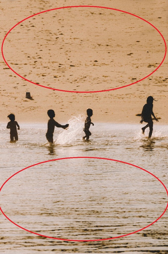
This is a good starting point and simple is certainly better, but perhaps you would like to experiment with more advanced placement strategies.
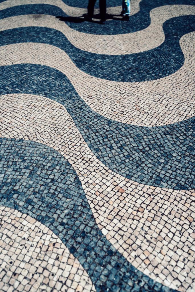
Example 2 – Using the gaps in your composition
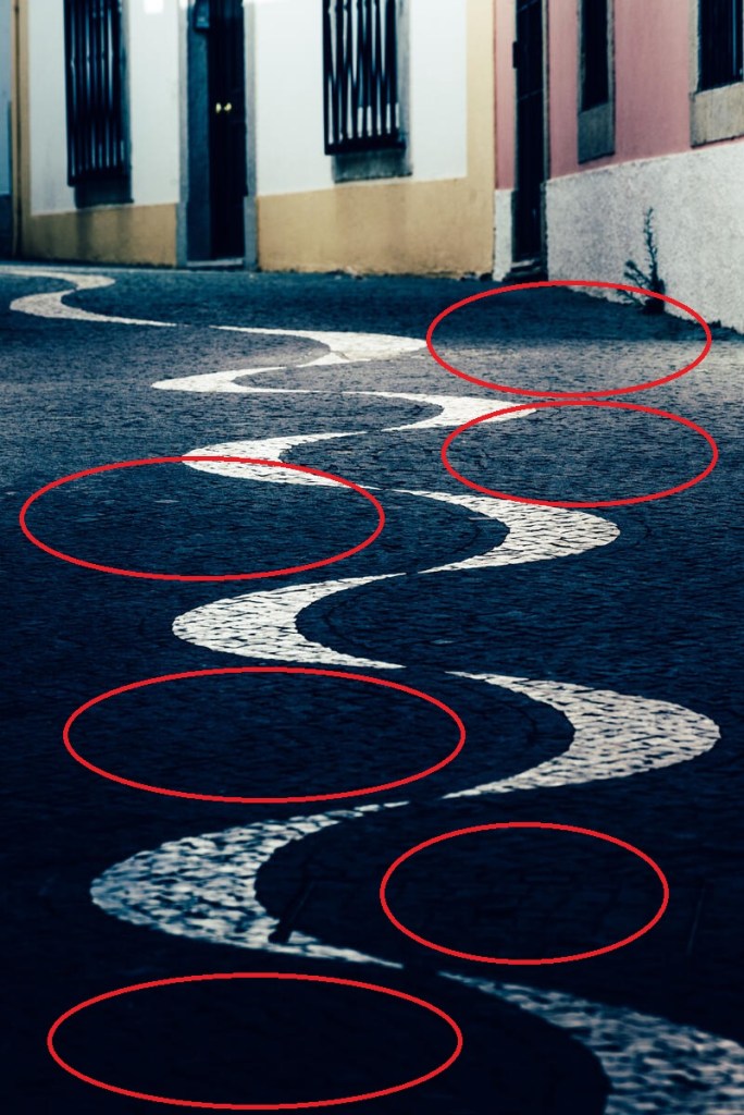
In this example, the gaps within the curves of the pavement serve as space to add the text should the designer wish to. Same with the following within the famous Portuguese tiles which are super slippery when wet (I know all to well from experience!):
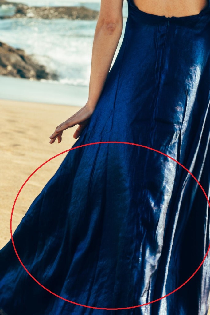
Example 3: Using the subject itself as space for text
This one is a bit more tricky as you’d be shooting / cropping slightly closer to the subject and it would act as the space for text. Ideally it needs to be a plain uniform colour so may contrast well with whatever font/colour the designer chooses.
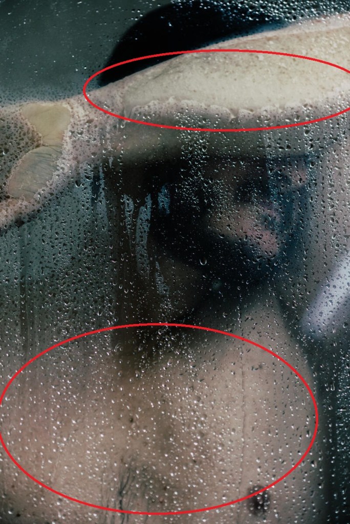
Here’s another example of yours truly where a designer my use my arm and chest to insert the text. Whatever contrasts well with the yellowish/greenish hue emitted from the bathroom light.
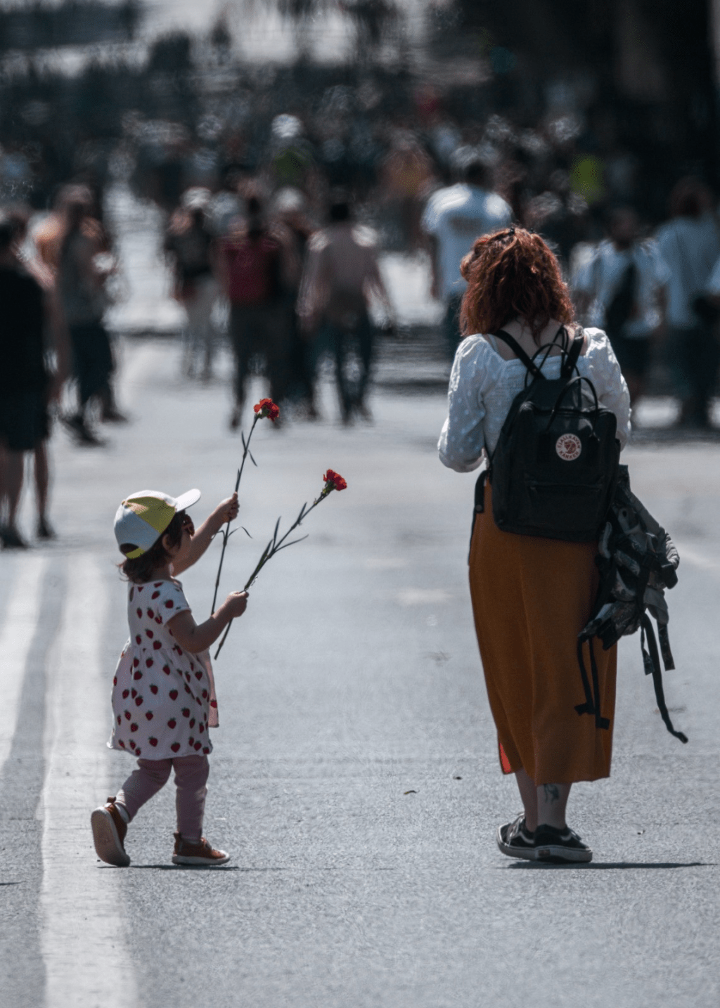
Example 4: Use of minimalism
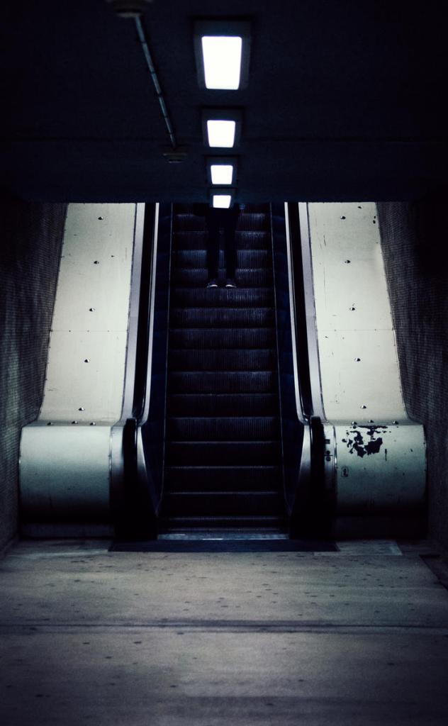
Probably the most popular genres for book covers are “thriller, suspense and crime”. A central aspect to these types of stories is the idea of “duality”, in other words: a story of “good vs evil”, “right vs wrong”, “one path vs another”, “to cheat or not”, “to kill or not” or perhaps a certain specific dilemma that the protagonist is contemplating.
One way to go to emphasize such internal struggle is to keep the composition somewhat vague, this can be done by adding shadows or selective cropping either when taking the shot or later on in post-processing. Even more effective, in my opinion, is to include minimalism.
For instance, in this example you can only see the woman’s legs as she goes up the escalator with plenty of copy space all over. I’ve also added symmetry so a Designer may use this composition to form some sort of “duality” concept. It’s pretty much an open canvas for a Designer and more likely to sell this way!
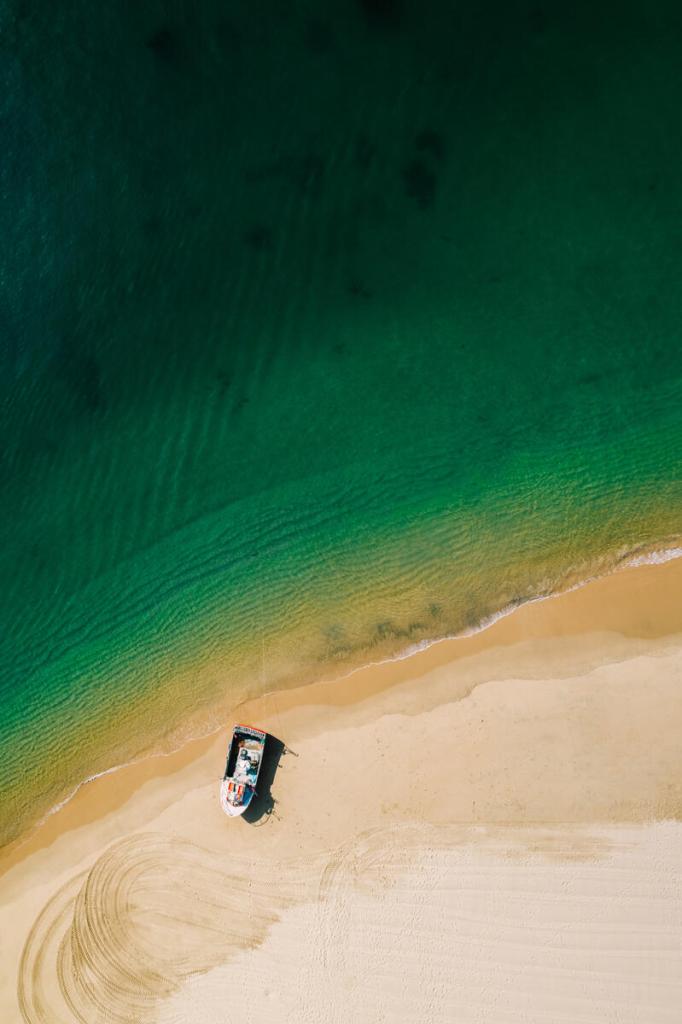
And taking this minimalist concept even further, even more minimalism for you…
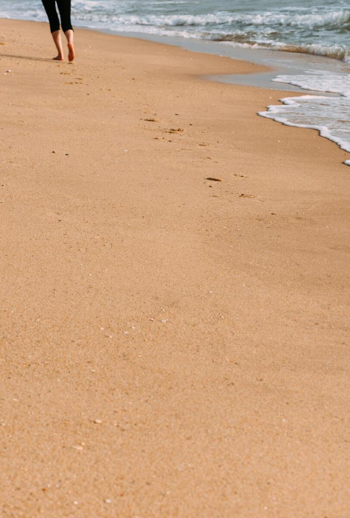
And here, instead of focusing on the boat as I would probably do for a traditional microstock shot (as it would take up something like 30% of the frame), I’ve instead focused on showing the scene with the turquoise water at the beach’s edge. This would be perhaps a story about a shipwreck in the Pacific. In a way, the natural elements are the story and the wooden ship on the beach is a side-story.
This composition offers the Designers maximum flexibility to include as much or as little text as he/she wants and in whatever size.
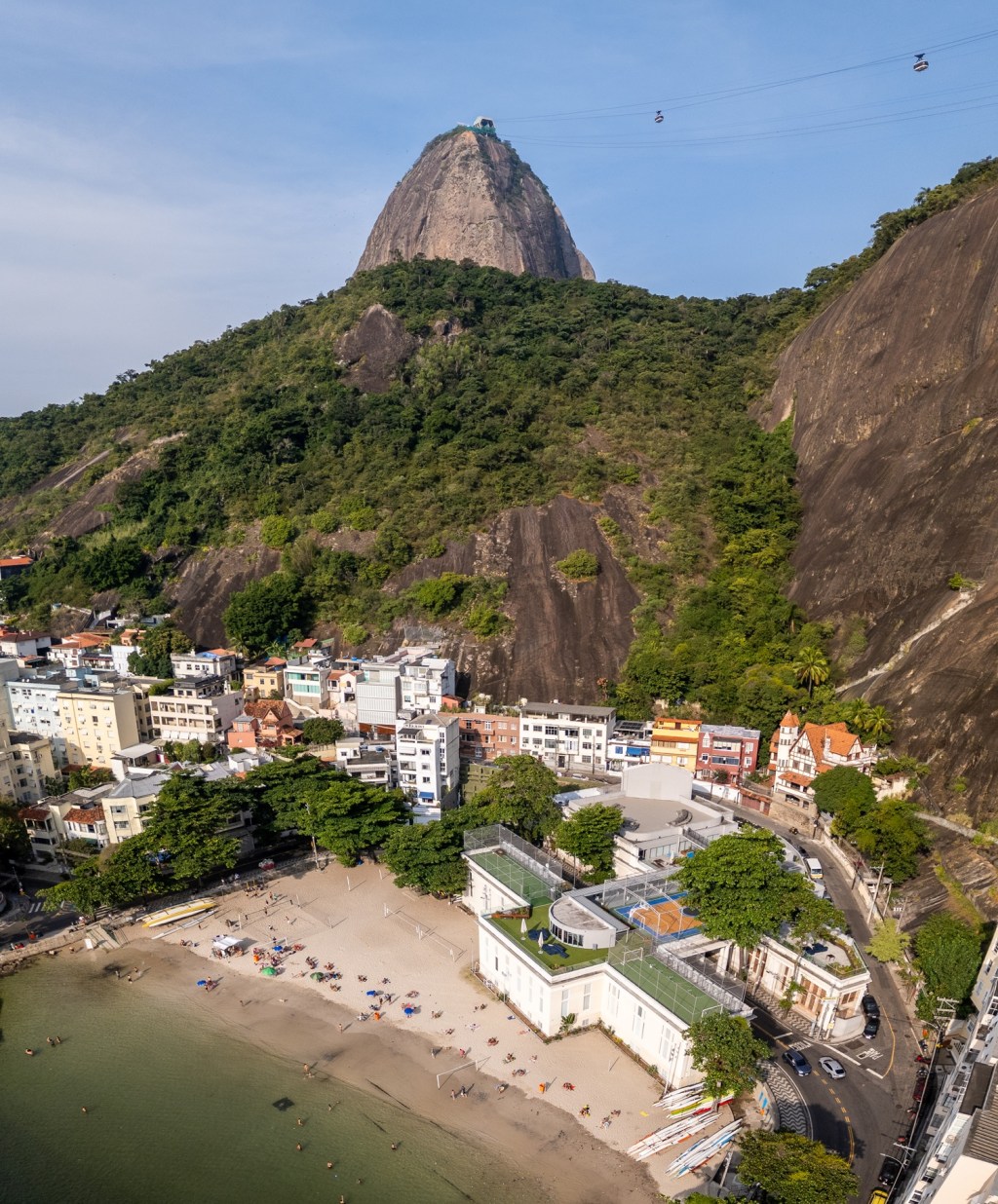
Example 5 – Shooting horizontals can be a good idea but be careful
Back to the anatomy of the book cover, on some occasions shooting horizontally is a smart decision since a designer may want to design a wrap-around-book cover such as this one.
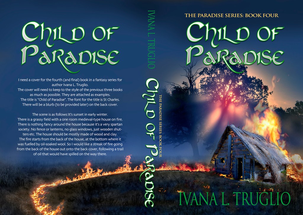
Although shooting vertically should be your default since on average it’s easier to have such images accepted, which end up selling, some scenes would do quite well horizontally. For instance these have recently been accepted at Arcangel:
Once you do decide to shoot horizontally, it’s important to keep the main subject on either side of the frame (never in the middle as they would end up on the spine)

With the way cameras are these days in terms of resolution, it’s relatively easy to crop a horizontal image into a vertical and achieve the minimum specification requirements. Just make sure to try to shoot a little wider if you can to give you this flexibility later on.
Hope you’ve found the above useful and please let me know if you have any questions/comments or ideas for effective book cover compositions to make Designers’ lives easier. Just give me a ring!

If you need quality stock photos to choose for your book covers, you can check platforms like DepositPhotos, which offer a wide range of stock images suitable for book cover design!
About Alex
I’m an eccentric guy, currently based in Lisbon, Portugal, on a quest to visit all corners of the world and capture stock images & footage. I’ve devoted eight years to making it as a travel photographer / videographer and freelance writer. I hope to inspire others by showing an unique insight into a fascinating business model.
Most recently I’ve gone all in on submitting book cover images to Arcangel Images. Oh and also recently purchased a DJI Mavic 2s drone and taking full advantage.
I’m proud to have written a book about my adventures which includes tips on making it as a stock travel photographer – Brutally Honest Guide to Microstock Photography


Leave a comment