On my latest batch of images from Venice, I decided to try something different. I shortlisted some 30 images or so images, put them on a PDF and kindly requested Master Steve Heap, as well as Ana, a local Venetian, to critique them. They’ve both consented to have their comments published, but Ana, (not her real name) has requested to remain incognito.
Embrace Constructive Criticism
I hope you find this exercise useful and seriously consider requesting others to critique your work with the aim of progressing as a photographer. I wrote about the importance of embracing a constructive critique on a previous post and also in my book.
For the sake of being succinct, I’ve narrowed down the comments to the following 20 images and will show the AFTER image I finally submitted for some of the images. You’ll notice how I listened to the criticism and tried to improve the image.
Here they are!

Steve’s feedback: “I like the idea but it looks horrible as a thumbnail – looks like an attempt to make the sky black for some reason. You could crop that roof out and make it panoramic, I guess, but it probably isn’t that great a shot.”

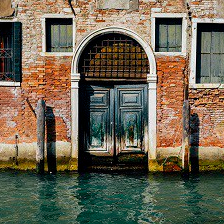
Steve’s feedback: “Lacking in contrast for some reason. The buildings and sky in particular. I would make the sky and buildings more contrasty with a graduated filter and perhaps cool down the foreground (ie warm the buildings and sky in the filter and then cool the whole image down a bit so the water is bluer. That dehaze filter might make a difference to the sky but don’t overdo it.”
After feedback:


Steve’s feedback: “Nice. You might have to remove the signs to get it accepted (foreign language) and I would increase the saturation of the colors. Bump up the contrast a little bit.”
After feedback:


Steve’s feedback: “Nice caught moment although the umbrella is pretty distracting and doesn’t play into the image. Street photography is surprisingly hard to make all the elements come together.”
After feedback:


Steve’s feedback: “Good story. I might crop out the person the left and hence zoom in a little more on the main group if you have enough pixels”
After feedback:


Steve’s feedback: “A comment for next time! It would have been better if the light had been in the sky rather than crossing the building. Bending down a bit could have done it!”
Ana’s general feedback: “Your colours, at least in the pdf, appear very punchy whereas Venice is more about muted colors – this alone will make those photos stand out well in the thumbnails and attract attention.”

Steve’s Feedback: “OK, but there isn’t much of a story there”

Steve’s feedback: “Nice – perhaps lighten the buildings just a fraction to see more detail (it could be my screen that is set rather low in brightness I guess)”
Ana’s feedback: “Venice monochromes don’t do well unless they are contrasty architectural elements or have a definite vintage feel. Unfortunately yours doesn’t fit into either of those categories so may struggle”
After feedback:


Steve’s feedback: “The background is too light and the subject too dark. More exposure at the bottom of the image and less at the top.”
Ana’s feedback: “You have some excellent angles (like the gondola outside the Danieli Hotel). I like the use of cropping for emphasis (assuming you are keeping the same aspect ratios as in the pdf)”
After feedback:


Steve’s feedback: “I like the idea but there seem to be haloes around the statues (could be a jpeg artifact?). I think it needs a bit more contrast”
After feedback:


Steve’s feedback: “Pity your hand is covered partly with a shadow… And the screen is horribly dirty. You could replace the screen with a proper image of the same place – I’ve done that before. Or take a photo of your hand and cellphone and superimpose on various images!”

Steve’s feedback: “These are tricky. If you have long enough exposure so the people blur, the boats blur as well! I’ve not done this myself, but you could have done a short exposure of the boats and an overall long one and blend the two images together. That would be nice if you have any other shots from the same place. It is OK though.”

Steve’s feedback: “It is a bit hard to tell what this is, although I know because of the previous ones [that it’s a glass making workshop]. It seems pretty noisy and low in contrast though”
Ana’s feedback: “Some of your shots in Murano have great potential – the box of colorful tailings on the floor and workbench with unfused glass especially.”
After feedback:


Steve’s feedback: “Good shot”
Ana’s feedback: “Unfortunately the glassblower shots are very oversupplied, so you may not find that they attract the attention you would like.”

Steve’s feedback: “OK, but lacking contrast (and interest I’m afraid). That isn’t to say you shouldn’t submit it!”
Ana’s feedback: “The ones that are going to let you down are the few with flat lighting and light mist out on the lagoon. I have found that anything with light mist is completely overlooked – people want thick pea souper mist or no mist. The only misty ones of mine that are looked at with light mist, are ones with early morning or late evening lighting which introduces some colour.”

Steve’s feedback: “Too much going on here. Is it the table, the people sitting on the boats? That person with the red scarf is distracting as well and the guy with the blue hat shouldn’t be walking out of frame”
Ana’s feedback: “I see you have gone in very close on people, lots of whom are locals. You certainly have more nerve than I do. I have had my head chewed off a couple of times by local Venetians for featuring them prominently in the frame and had to ditch the photos so have now backed off a bit and set my people further back in the scene. Will be interesting to see how your shots do.”
After feedback:


Steve’s feedback: “OK, but what is the story?”
Ana’s feedback: “Any way you can introduce a bit more depth of definition inside the sotoportego on the Calle Ghetto Novissimo shot with the doggy? The concept is good but the walkway is quite dominant in the frame and, in the pdf at least, needs a bit more depth of light and detail.”
After feedback:


Steve’s feedback: Crop out more of the orange building on the right to show the two people and the old brick?
Ana’s feedback: The character studies of Jews in the ghetto are nice as the old man is so stereotypical – they should do well.

Steve’s feedback: “Yes, interesting angle”
Ana’s feedback: “The shots along Strada Nova are good but the market stalls you have photographed are temporary for Easter, so are seasonal and not really representative of the area through the year. It is an important area to photograph as almost every tourist walks through there, so maybe next visit you could try to redo some without all the stalls.”

Steve’s feedback: “Not sure what the building is or why it is interesting. I think the background is too bright and would reduce brightness over there with a graduated filter”
Ana’s feedback: “The fact that your Ferrovia/Santa Lucia shot has no people may work against you as it is the transport hub and therefore more usually associated with teeming masses of people. On the other hand, the very fact you have no or very few people people may attract attention”.
A Nice Combination
In this case, the combination of Steve’s technical eye and Ana’s knowledge of local trends proved extremely useful. Thank you Steve and Ana!
Steve IS a commercially-minded guy (with Backyard Golden results to prove) but his subject knowledge about Venice is limiting, which isn’t his fault. So having had the opportunity to ask a local to critique was a useful way to fill in knowledge gaps about places and local trends. Next time I go back to Venice (soon I hope because I love that place) I’ll be more familiar with which types of images would be more profitable, combined with the results of these latest batches.
So the lesson is, if you’re looking to have your travel images critiqued, it helps if you ask a local! Next time someone has images of Rio that need critique, please let me know!
Final Thoughts
As mentioned in my introduction, receiving constructive feedback is so important. Just be aware of who you ask and which advice to take on board and which to ignore. If receiving negative feedback hurts you, try not to take it personally.
Until next time – Alex
About the Author
Alex is an eccentric guy on a quest to visit all corners of the world and capture stock images . He’s determined not to waste his life away as a corporate drone so he’s devoted his past four years to making it as a travel photographer and freelance writer. He hopes to inspire others before it’s too late.
He’s written a book about his adventures and includes tips on making it a stock travel photographer – it’s called the Brutally Honest Guide to Microstock Photography

Leave a comment